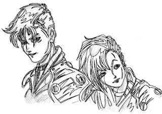
If you're a dab hand with the mouse, you could always draw your artwork straight off onto the screen, but most of us mortals are going to need a picture to work with as a base. If your creative skills leave a little to be desired, or you're new to working this way, it can be easier to use well drawn artwork by an established artist. Screenshots are also a good idea. Or of course you can sketch something yourself. Whichever way you choose, all you'll need is a .gif or .jpg that you can import into Flash and size up to the movie dimensions.
Below is an image that I've scanned in, and this is the one that I'll be demonstrating with in the tutorial. Feel free to download it to experiment with.
[ original art ]
Once you've chosen your starting picture, import it into Flash, place it on Layer 1 and lock it. Create a new layer just above it - this is the one we will start drawing on. Depending on your drawing skills, you can either draw freehand or with the line tool. Anime artwork especially is generally composed of a lot of curves, and I find that to get the quality of these with the pencil is very difficult. Having said this, there are times when you find that lines won't cut it, and you just have to use the pencil. If you do, I recommend clicking on the smooth or ink options first. The smoothing effect that you will get depends on the magnification. Too far out and it may smooth over too much, and you won't get the line that you need. Play around with the zoom to get an idea of how it changes your lines. Ink allows those of you with very precise drawing techniques to get exactly the line you have drawn.
Now we are ready to begin drawing. I always draw two sets of lines - one for all the major outlines, and one for minor guides. The major lines (which we will draw first) define the general shape of the image. Minor lines act as a reference for colour and shading.
Open up the stroke panel, and select a weighting of .75 to draw the major lines. Go over the main parts of the drawing, drawing a line then curving it as need be to fit the original.
Draw a line...
...then curve it to fit.
Keep an eye out for the snap to objects tool. If it is selected, you may find that your lines will join together when you don't want them to, especially if you're drawing two lines very close together. Either try zooming in further or switch the option off if you need to.
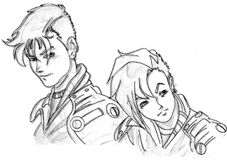
Occasionally, you'll find that the lines you're drawing will intersect, and you can't curve them properly. If this happens, create another layer on top of the one you're working on. Draw the line(s) that you need, then cut them and paste in place on your working layer. Once you've gone over the main outlines of your picture, you'll have something that looks like the image below. If you hide your base layer, you'll get a good idea of how your drawing is progressing.
[ Image with major outlines. ]
You'll see that there are still a lot of lines in the original drawing that have so far been ignored. Now it's time to define these as areas of shading that you will use when you colour your picture. Choose the finest weighting available on the stroke panel, which is .25, and create a third layer, locking the one you have just been working on. It may be an idea to use a different colour in this layer, so you can see where the divides are clearly. It's also helpful to decide where the light source in the picture is coming from, to help you get an idea of highlights and shadows.
At this point, things will start to look a little strange with lines all over the place, but don't worry about it. The guides get erased and it all comes together in the end.

[ Image with major and minor outlines. ]
Once all the lines are completed, select the entire third layer, copy and cut it, then paste into place on the second layer so it combines with your major guides. If you chose to draw the minor lines in a different colour, now's the time to make them all black. You can also delete you base picture, unless it's in colour and you'd like to follow it when you shade your own drawing.
Start to colour in the picture. I've found it's better to begin with the faces and hair. However, getting the skin tones right is quite a challenge. On the right is a small palette of colours that you might find helpful for skin and lips.
Occasionally as you fill in the shapes you might find that some of the lines don't quite meet, so the fill will overflow. All you have to do is drag the end of one line to meet the other, and erase any overspill.
[ Beginning to colour. ]
[ Skin and mouth tones ]
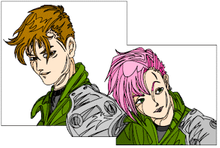
It can also be adviseable to draw a bounding box round the picture, especially if there is no fixed edge to it. This way you won't run into any problems when filling in. Tidy up any little bits that need adjusting as you go.
[ Image with colour and boundary box. ]
Once you've finished colouring, all that remains is to choose which lines you want to erase. The minor lines always need to be discarded, as we only used them as a guide. However, you might decide that you prefer the picture with the major lines in tact. If so, try reducing the stroke width to .25 to get a clearer picture.
I tend to erase all the lines - simply double click on the black outlines and delete. As the vanish, you might find little gaps in the colour. Simply fill them in as you go.
Finally you will end up with your finished image.
[ Finished image ]
Until next time...
source of : http://www.blogger.com/post-create.g?blogID=812046204731191928


0 comments:
Post a Comment